
The symbols of the Joint Institute for Nuclear Research include the official logo and flag of the organization, along with the JINR Emblem.
JINR Logo
Historically, the JINR symbol is the Synchrophasotron building combined with electron orbitals, which give a visual reference to nuclear research, Institute’s key scientific activity. In March 1957, JINR launched a legendary physics facility, the Synchrophasotron, a proton accelerator operating at 10 gigaelectronvolts. The Synchrophasotron became one of the brightest achievements of Soviet and global science: its energy was the world record and took a month after the launch to reach. This accomplishment made JINR a leader in the accelerator technology.
Please note that when graphically reproduced, the JINR Logo must always be full, with no changes or additions.
|
|
|||
|
Download sets of logo variants in one .ZIP archive (dark, light, Russian, English) |
|||
| SVG | PNG (20 mm) | PNG (60 mm) | PNG (for email) |
JINR Flag
The image of the Synchrophasotron became the basis for the official JINR Flag. The azure background colour of the JINR Flag reflects peace and unity, it is also the colour of water. According to the JINR Charter, research results obtained at the Institute can be used only for peaceful purposes for the benefit of the whole mankind. It is with this aim that the JINR Member States have joined their scientific efforts in Dubna, our common home on the banks of the Volga River. Thanks to the rivers (not just Volga, but also Dubna and Sestra) and the Ivankovo Reservoir, the JINR residence city is surrounded by water on all sides, practically making it an island.
The RGB colour of the JINR Flag is 0, 154, 254. According to the regulations on using the JINR Flag, two ratios of its width to length are allowed: 2:3 or 3:5. A detailed description of the JINR Flag and its use is given below in the relevant code and regulations.
JINR Flag Code and Usage Regulations
Please note that when graphically reproduced, the JINR Flag must always be full, with no changes or additions.
 JINR Flag 2:3 |
 JINR Flag 3:5 |
JINR Emblem
In 2024, as part of the renewal of the corporate design in the Joint Institute, a new symbol, the JINR Emblem, was created. This stylisation of the JINR Logo is designed to provide additional opportunities for using Institute’s symbols in printing and on web platforms, merchandise manufacture, and in presentations by employees. The JINR Emblem is based on the well-known image of the Synchrophasotron building. Its outlines are reproduced by seven columns symbolising the pillars of the Institute, its seven scientific laboratories. The seagull on the edge of the orbital serves as a symbol of scientific freedom and illustrates JINR’s emphasis on continuity. Thus, the legendary Synchrophasotron became the basis of the new Nuclotron Accelerator, the core of NICA, JINR’s current flagship megascience project. NICA (Nuclotron-based Ion Collider fAсility) is being created for the researchers to find out why quarks, a fundamental component of matter, united in a certain way at the birth of the universe, determining the way our world is today. The word “quark” was borrowed by Gell-Mann from James Joyce’s Finnegans Wake novel featuring a scene where seagulls shout: “Three quarks for Muster Mark!”, which is presumably an onomatopoeia of the cry of these birds. In addition, any Dubna citizen knows for sure that a significant population of seagulls inhabits the city and the JINR sites during the warmer months. These beautiful and brave birds have become a kind of a symbol of the science city.
Please note that when graphically reproduced, the JINR Logo must always be full, with no changes or additions.

|
|||
|
Download sets of logo variants in one .ZIP archive (dark, light, Russian, English) |
|||
| SVG | PNG (20 mm) | PNG (60 mm) | PNG (for email) |
Corporate graphics
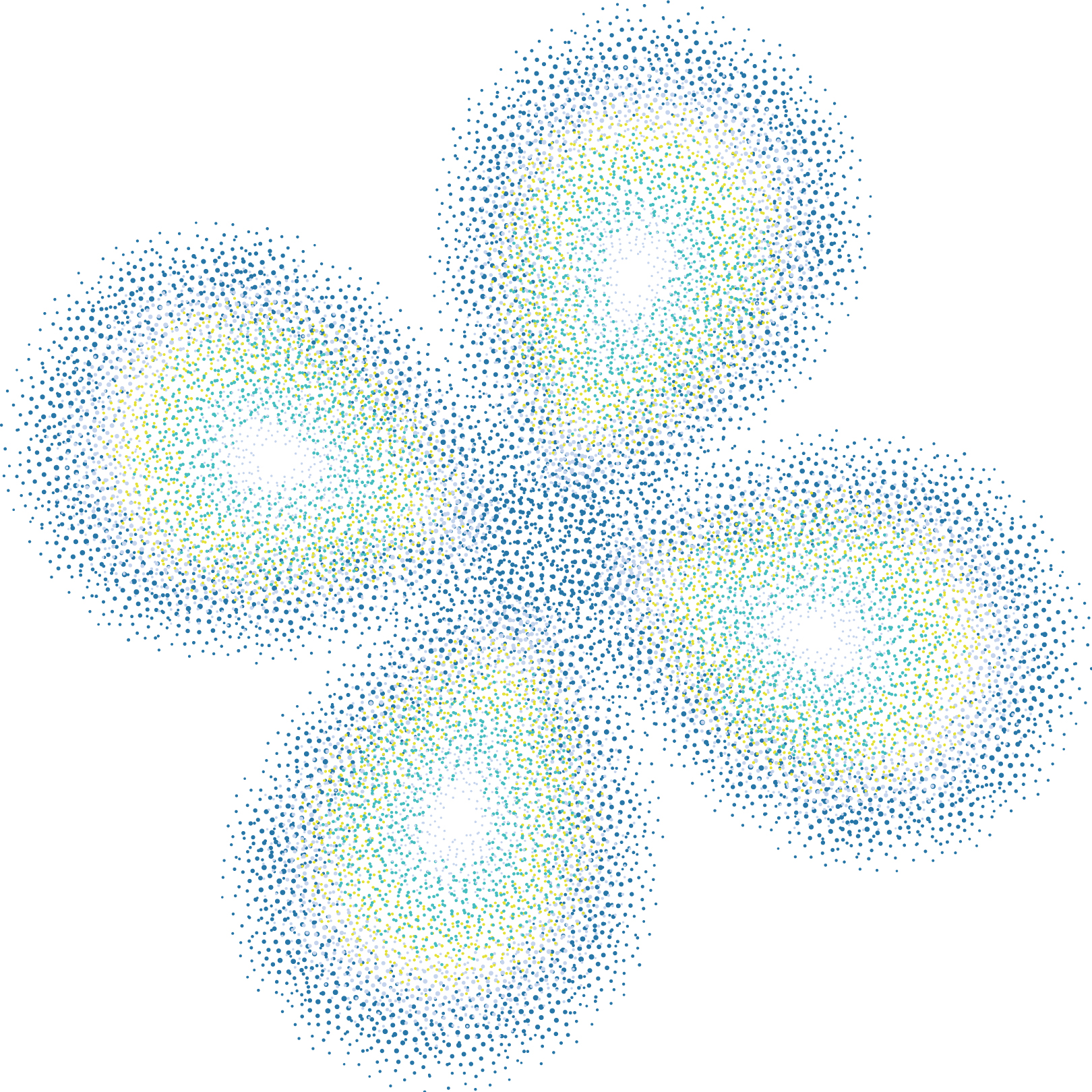
The graphics refer to the electron clouds of atoms. It epitomises the innovative and modern approach of the Institute striving to be at the forefront of basic and applied science. The electron clouds convey the idea of rapprochement, multiscience, and internationality in the best way possible.
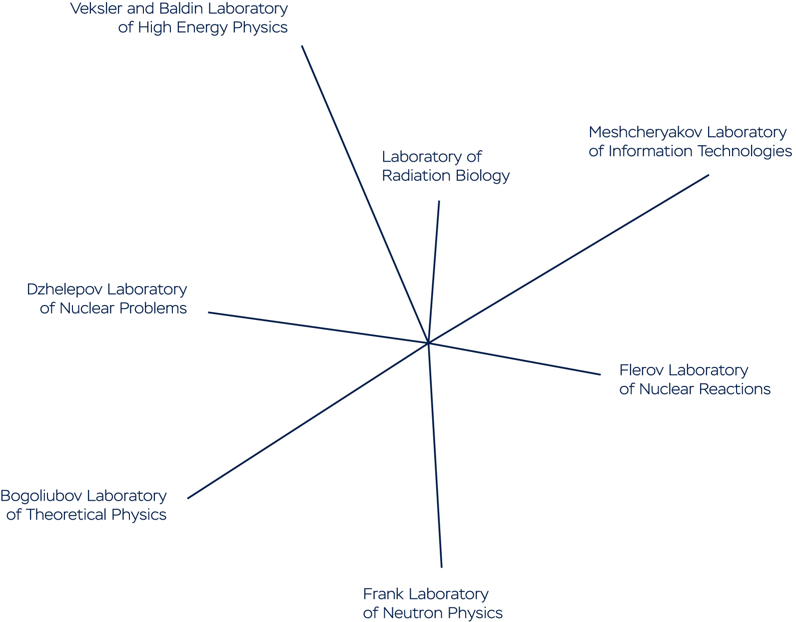
The rays are one of the graphic motifs of the corporate graphics. They symbolise the unity of the 7 laboratories.
 Electron clouds |
 Rays |
In the JINR Brandbook attached document, you can find a detailed guide to using the corporate style of the Joint Institute for Nuclear Research, its colours, and graphic elements.
Here you can download a set of graphic elements from the JINR Brandbook in one file for use in your work.